


Cart
0
So You Hate Color—Now What?
Not everyone is drawn to bold hues, and that’s perfectly fine. A preference for neutrals is not a limitation—it’s a design philosophy in its own right.
At its core, a neutral palette offers calm, cohesion, and quiet confidence. These tones don't compete for attention; instead, they provide a refined backdrop that allows a space—and the people in it—to feel more grounded. Whether it's shades of beige, taupe, cream, or soft grey, these colors invite a sense of ease and longevity that outlast trends.
There’s often a misconception that decorating without color means sacrificing character. In reality, working with neutrals opens up the opportunity to focus on the details that make a space feel elevated: materials, textures, and subtle shifts in tone. It's about creating an environment that feels thoughtful and lived-in, not over-designed.
For those who prefer simplicity and subtlety, neutrals and browns become the perfect building blocks for timeless interiors.

The Secret Sauce: Texture Over Tone
When working within a neutral palette, the key to creating visual interest lies in texture. Without vibrant colors doing the heavy lifting, it’s the feel—and the look—of a surface that brings a space to life.
Think soft linen cushions paired with rich velvet upholstery. Or a handwoven jute rug grounding a space alongside a polished wood table. Even within a narrow range of tones, these layered materials introduce warmth, depth, and dimension. A matte stone vase, a ribbed ceramic lamp, or a slubbed cotton throw—each one adds subtle contrast that draws the eye and elevates the overall setting.
Texture is also where personal taste becomes visible. A clean, structured aesthetic might lean into crisp cottons, smooth leathers, and brushed metals. Meanwhile, a more organic approach might favor unfinished wood, raw linen, and nubby boucle.
When color takes a back seat, texture steps forward—and it's often the detail that makes a neutral space feel complete, not clinical.

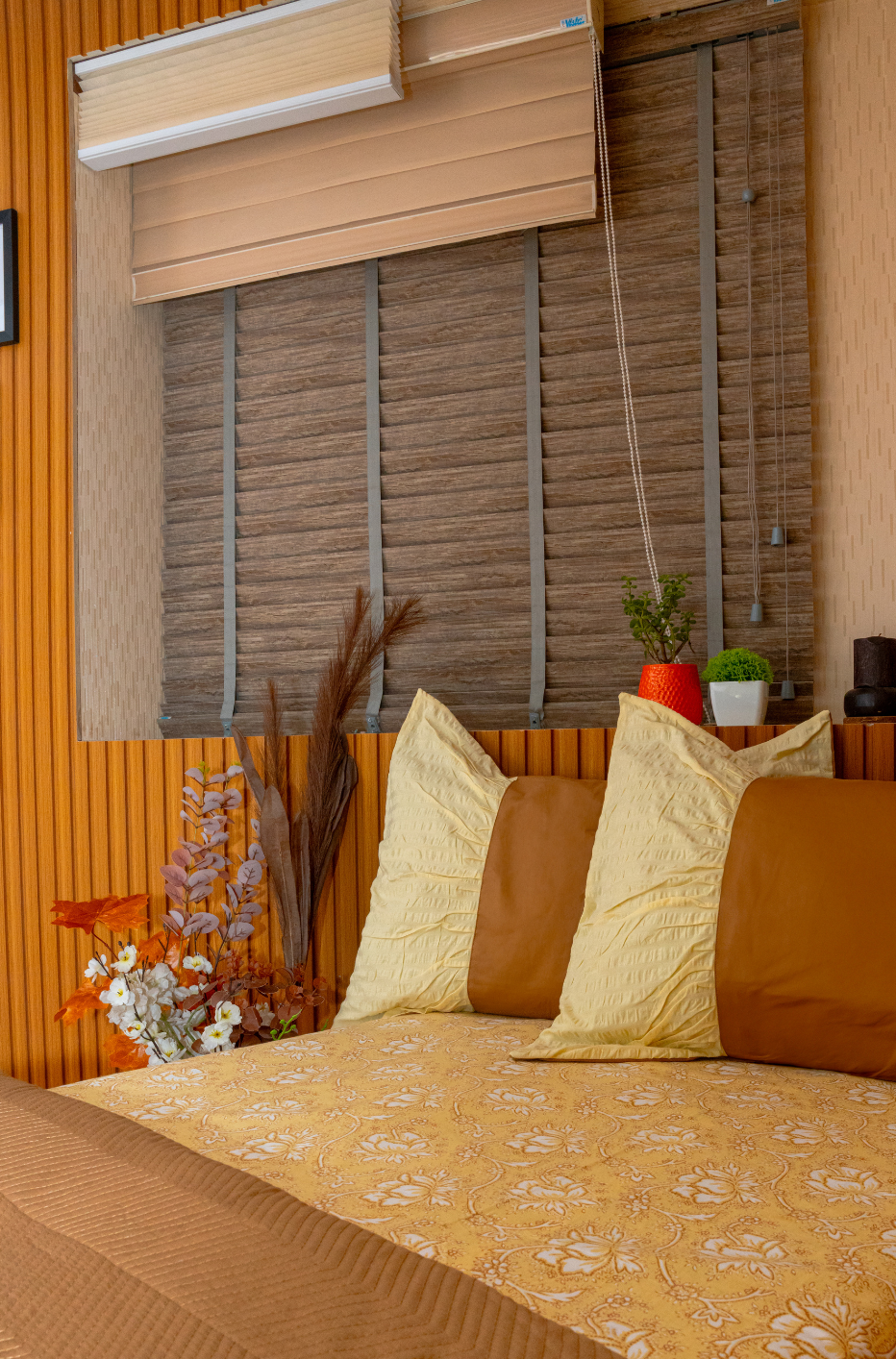
Browns Deserve a Comeback
Among neutral tones, brown is often overlooked—but it’s one of the most versatile and grounding colors available in interior styling. Rich, earthy, and inherently warm, browns bring a sense of depth and natural elegance that lighter neutrals can’t always offer on their own.
From soft camel and tan to deeper shades like walnut, cocoa, and burnt umber, brown adds dimension without overwhelming a space. These tones pair beautifully with creams, greys, and beiges, creating layers that feel cohesive yet characterful. In fact, even a subtle introduction of brown—through a wooden coffee table, leather accent chair, or chocolate-toned cushion—can shift a room from flat to inviting.
Brown also works exceptionally well across different textures: a rust-colored velvet adds plushness, while a grainy oak cabinet adds structure. These variations not only warm up a neutral palette but also introduce an organic feel that brings comfort and timelessness.
As trends swing between extremes, brown remains a constant—quietly luxurious, effortlessly grounding, and always in style.

Mixing, Not Matching: The Key to Depth
One of the most common pitfalls when decorating with neutrals is going too uniform—matching every tone too closely, every fabric too neatly. The result? A space that feels flat, monotone, and a little too perfect. The solution lies in contrast and layering within the same muted palette.
Combining warm and cool neutrals—like pairing a greige sofa with crisp white curtains, or placing a sand-toned cushion against a soft dove grey chair—creates gentle visual breaks that make a room feel lived-in and considered. It’s these subtle shifts in tone that add complexity and movement without stepping outside a neutral color story.
The same principle applies to materials. Sleek surfaces like metal or lacquer play beautifully against raw, tactile ones like jute or unfinished wood. A structured linen cushion on a plush velvet sofa, a marble tray on a grainy oak table—these pairings add richness without adding noise.
Ultimately, mixing neutrals allows for a more expressive and layered environment. It invites contrast, but on a quiet, sophisticated level—perfect for anyone seeking warmth and elegance without excess.

Let Neutrals Set the Mood (Not Steal the Show)
A well-designed space doesn’t always need a focal point shouting for attention. Often, the most memorable interiors are the ones that feel calm, effortless, and quietly intentional—and that’s exactly where neutrals excel.
Neutral tones have a unique ability to influence atmosphere without becoming the main event. Soft creams, warm taupes, and gentle greys create a sense of stillness that allows a room to breathe. They act as a backdrop that enhances natural light, softens sharp edges, and gives space for personal pieces—books, artwork, heirlooms—to stand out.
This balance is especially important in multifunctional spaces. In a living room that doubles as a workspace, or a bedroom that needs to feel both restful and expressive, neutrals adapt seamlessly. They don’t dictate mood—they support it.
When used thoughtfully, a neutral palette doesn’t flatten a space; it allows it to unfold naturally. The room becomes more about how it feels than what’s inside it—and that, in itself, is a powerful design choice.

Cozy, Calm, and Still So You
A neutral space doesn’t have to feel impersonal—it just needs to feel intentional. When done right, it becomes the kind of environment you look forward to coming home to: one that’s calm, grounded, and unmistakably yours.
What brings that personality in isn’t loud color—it’s the thoughtful mix of textures, the choice of materials, the items you bring into the space. A warm-toned throw from a favorite trip, a stack of well-loved books, a vase you always fill with eucalyptus—these quiet details add soul to a setting that’s otherwise minimal.
The beauty of working with neutrals and browns is that they give everything else the chance to shine. They don’t fight for attention. Instead, they hold space—for comfort, for function, and for expression. They allow a room to evolve over time, making it easy to layer in seasonal changes or shift moods without starting from scratch.
At its heart, neutral styling isn’t about playing it safe. It’s about creating a canvas that feels effortless and timeless—one that reflects who you are without saying a word.


